Videos with rounded corners
Published on


Sometimes you come across a design that seems impossible to implement. I’ve encountered one of those some years ago and think the solution is still valid. So here’s a peek into solving one of those ‘impossible’ designs in code.
I looked at a fresh and modern design for the client I worked at. Modern as in: a very bold design for this type of client. So bold, I wanted to use the stereotypical developer saying: “it’s impossible, design something else”.
That sentence was almost like a mantra for the developers at the team. I decided to react differently. “Fuck it, I will even work overtime in order to make it work”, I thought. Key in this design were the rounded corners, which the client needed them to make the site appear friendly.
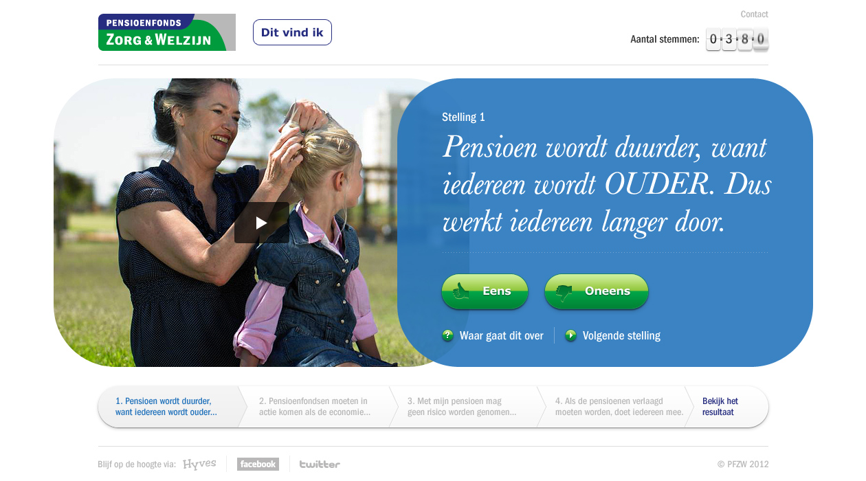
The design also featured rounded corners on a video, which I figured would make development more difficult. I told the client it’d be hard to make this solution and they should be prepared for some adjustments of the design.
When I started coding this component, I expected that a <video> or <iframe>-element would be styleable. Simply adding border-radius to the CSS would be sufficient. Nope. Almost everything I tried to style of this element didn’t do anything. Then I thought of one of those (old) tricks I used earlier that week.
IE hacks to the rescue
There are different techniques for adding rounded corners on elements. My favourite technique at the time was adding elements with the corners as a background image. It works by adding an element for each corner that holds the image.
<div class="video">
  <iframe><!-- video --></iframe>
  <div class="corner top-left"></div>
  <div class="corner top-right"></div>
  <div class="corner bottom-right"></div>
  <div class="corner bottom-left"></div>
</div>The images of the rounded corners are added with CSS. Around that time I relied heavily on image sprites. The following code should be a no-brainer for front-enders.
.video {
  position: relative;
}
.video .corner {
  position: absolute;
  width: 90px;
  height: 90px;
  display: block;
  content: '';
  background: transparent url('sprite.png') no-repeat;
}
.video .corner.top-left {
  top: 0;
  left: 0;
  background-position: 0 0;
}
.video .corner.top-right {
  top: 0;
  right: 0;
  background-position: -90px 0;
}

/* and so on */When decreasing the viewport size, there is a certain point where the video is so small, the rounded corners don’t look right anymore. I discussed with the designer and we came up with a simple solution: make the radius of the inside out circle smaller. In smaller viewports, we switched the coordinates to show another part of the image sprite.
That’s it!
I made this site during my first few months at Mirabeau. While the exact code is obsolete, I believe laying images over a video is still the way to go in order to achieve this effect. When I’d be asked to implement a similar design now, I’ll use vector graphics (SVG) for the corners. That way you won’t need images in various sizes.
With this project I learned the joy you can have as a developer with surprising people: making stuff work that others would call impossible.