Typography is worth a thousand words
A story about progressive enhancement
Published on


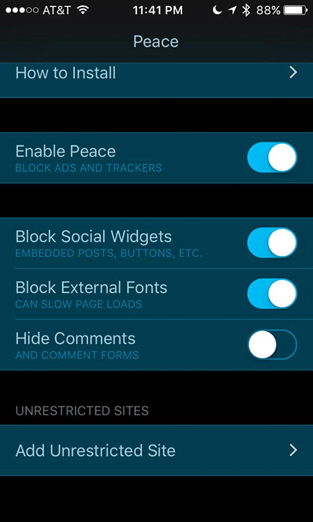
We’ve got something new to play with: the possibility to block advertisements on iOS with an ad blocker on your smartphone. Several apps have hit the app store lately, among them Purify and Peace.
‘Ad blocker’ is actually a misleading name for this kind of app, because it concerns a generic enhancement blocker. It allows you to block JavaScript, images and web fonts as well as blocking ads. With one simple act, users can turn off all web fonts for all websites they will visit in the future. Enhancement blocker? That’s more like it.

JavaScript, images and web fonts that could be blocked with an ad blocker should never be more than enhancements. They’re extra, separate layers that lay on top of the base layers of the web. Every website should work fine without these enhancements. That’s the core of ‘Progressive Enhancement’.
Every designer or developer who has a bit of understanding of the web knows this. But if we’re honest: designers and developers usually don’t comply with this. Websites don’t work without JavaScript or are not very legible when a web font doesn’t load. Apple offering ‘enhancement blockers’ in their appstore, could be seen as a major wake up call.
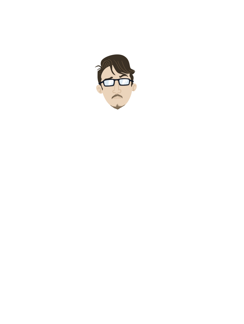
Dear designers and developers, do you remember thinking “Yeah, but the times users don’t see a font, those are edge cases. I don’t have to design for that. I don’t have to code for that.” or perhaps: “I’ll do it later”. Well, chances are that your clients’ visual identity gets lost when the web font isn’t available, like when you haven’t defined a fallback font as seen below.


It’s obvious that you can’t predict your users’ behaviour. And that might not even necessary, all because of progressive enhancement, ladies and gentlemen. When designing and developing, take the layered aspect of the web into consideration. But, of course, progressive enhancement is just a set of ground rules. The main reason to put special effort into your font is…love!
Love me two times
Generally, designers show a lot of love for typography. Too bad it’s usually only directed towards the ‘happy flow’. Real love shows when things gets tough, when you’re confronted with a less than ideal situation. Like when a user sees the fallback font instead of the web font. That’s when you have to show your true love. The choice of your fallback font deserves your full attention. When you’re done with this basic layer of the web, you can focus on the happy flow – the enhancement: the web font. Just read this article about choosing a fallback font from 2011.
Thanks to ongoing technical improvements, the end user is becoming more and more powerful. The new enhancement blocker in the appstore is one example of this development. The user’s increasing autonomy forces us to think differently about the choices we make. How will users respond to the possibility to shut off particular enhancements their smartphones? We don’t know for sure, but it seems that users have enough reasons to make use of this new type of app. Users save data, which saves them money and loading time. So what do you think? Check out this slide deck for a clear overview addressing font use. You can look up the numbers yourself over here: httparchive.org
If a user shuts off web fonts on his smartphone today and visits your website next week, do you think he will know that your website’s layout is broken, because of the missing web font? No, an ordinary user will not make that connection. He will only see a broken or difficult-to-read website. You’re done.
But, as said, eventually it’s not about the power of the end user or the rules of progressive enhancement. The first and most important reason for a designer to think wisely about typography on the web is love!
By the way, Dear Designer, when you pay attention to all of your typographical design decisions, please also take note of FOUT, the Flash of Unstyled Text. The technical implications of FOUT are the working area of a front-end developer, but a designer should properly understand what happens and what the design implications are of FOUT. I don’t think you’ll like it, but yeah, true love…
Because a web page is built up in layers you can only see the web font in the moment it loads via JavaScript. This takes a while. We do this with JavaScript because we can also test if the web font is actually loaded. This mechanism is, like many examples on the web, not entirely perfect and the consequence is FOUT. Read more about what this means in these 4 short articles that get you on track with FOUT.
There are many cases of imperfections on the web and they won’t disappear. Paying attention to these imperfections in your design and/or code decisions is always better than to ignore the. As the makers of ffffallback.com would say, “It’s a brave new world”. I would like to add that typography on the web is a beautiful part of that new world.
Give it all your love!