Learn from past projects: use progressive enhancement
Progressive enhancement helps you making stuff easy
Published on


Every now and then people ask me for a good example of progressive enhancement. Especially how it has been used in real life. Within the travel industry, I worked on a cool project. Let me tell you about how we did things there.
A few years ago, my colleagues at Mirabeau designed an interface for a transport company, where you could reserve the place where you want to sit. I was asked to check the code of the tool. When you used the interface on an iPad, the browser crashed. I needed to provide a solution for this problem.
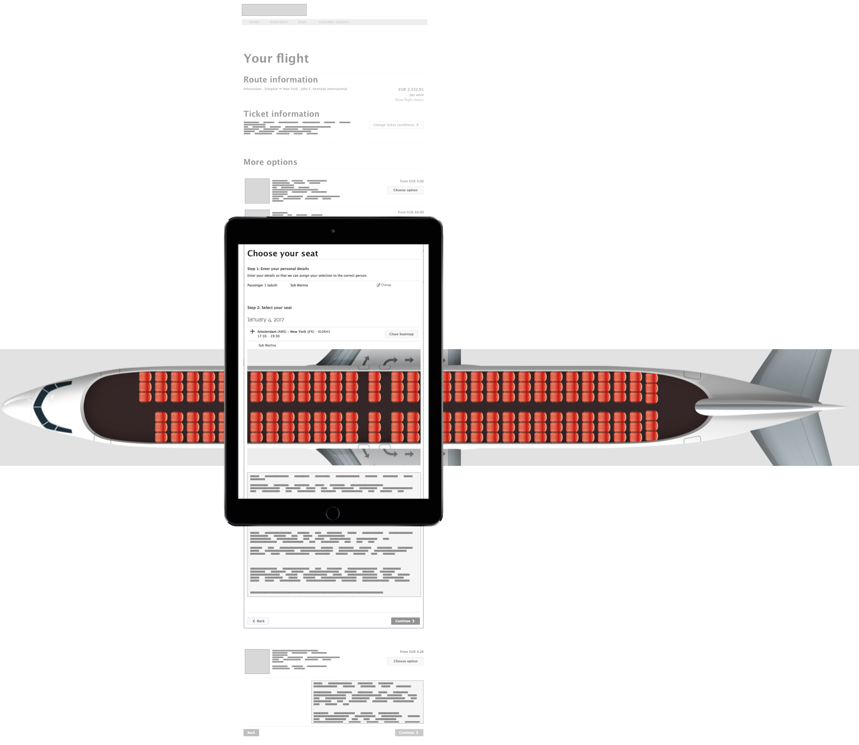
I began to investigate and found out that the HTML code was quite small. While the HTML was about 1.000 lines of code, after the JS was done executing, it grew to 51.000 lines of code in the DOM. That is really a lot. There was a lot of inline CSS and JavaScript in there.
One thing the JavaScript did was calculating where every seat needs to be placed. With CSS every seat was positioned. This technique is known for getting slow while rendering the page.
An example of the interface. A lot of this airplane gets rendered outside the viewport, inside an iframe

Summarised, the iPad crashed because of three things:
- too much JavaScript processing and dynamically positioning of elements that were made with JS;
- a background image that was too large;
- most of the page was rendered outside the viewport. The page was not only tall, but wide as well.
These reasons combined asked to much of an iPad. Remember that we dealt with the first generation iPad, which has much less processing power and memory as the current line of tablets available.
The ‘real’ problems and their solution
I was wondering, why is so much processing done with JavaScript? The placement of seats isn’t so dynamic that it should be calculated with every booking. Making the seatmaps beforehand with plain HTML would make things easier. For example it’d take away calculating work from the browser. The whole experience would be faster.
One thing I noticed about this project: it was a waterfall project. A lot of iterations were made in collaboration with the client, with developers available. However, the final designs were delivered to the developers while they needed to work on the application. In the end there was not enough time for developers and designers to work together.
Let’s do things better
A few months later I took the learnings from this project to make the same kind of interface for another client. This new project had two major differences:
- designers & developers worked together in a scrum team;
- we had a mobile first and progressive enhancement approach.
Working on a scrum project usually means continuous delivery as well. We needed to deliver something that works every two weeks. Together with the mobile first and progressive enhancement approach it forced us to do things in a simple way.
It’s just a form
For the frontend code, we started out with the simplest way of letting a user choose their seat. A form with radio-buttons. This works in all browsers. And because of this simple choice we also made backend development relatively easy. By just placing the seats in lists in HTML we skipped the need of writing a lot of code, like in the first project. Backend developers could work on their logic on the server and frontend developers built the graphic layers on top of the form.

When we had this minimal viable product, we added JavaScript to enhance the interface. The user could see some extra info depending on which seat it clicked on. The chosen seat number and price (if applicable) were present.
As a team we proved the power of a mobile first and progressive enhancement approach with this feature. Doing scrum for this project was necessary to do all the iterations, building layer upon layer.
Bottom line
Without my knowledge of the former project, I couldn’t have built such a lean interface as I delivered with the latter project. Given that, I think that in web development we generally lack looking back on things. For some projects we’re reinventing the wheel.
What we did at the second client was a big contrast compared to what we did earlier. The interface of the first client was dependent on JavaScript. It wouldn’t work without loading all the code needed for displaying and interaction.
As I mentioned before, websites can break because of numerous things. If you’re checking in abroad while not having a great connection, this process could be a pain in the ass. By ‘moving’ code from frontend to backend, we improved the user experience.
In my opinion progressive enhancement and scrum strengthen each other. Think of it when starting your next project!