Front-Trends 2017 highlights
Things I was excited about during this conference
Published on


I love being at conferences. Since I’m writing articles, I want to share more and more knowledge. So here are my highlights of Front-Trends 2017.
Covering every presentation is difficult. I picked some talks which had some good learnings I want to share. Still, there was too much information to cover, so I chose the talks I was happily surprised with.
Field-tested interfaces for the next billion
The next billion is referred as the big wave of people who will be connected. Connected in this context means having access to and using internet. Some figures were shown about connected people.
Important take away is “Empathy shouldn’t replace research”. Later on, Ally concluded with “Be curious, do have empathy. But do the research”.
Lessons learned about users:
- There isn’t a typical user, just as in the western world
- Type of devices are usually cheap, low end, Chinese knock off and/or Android phones
- Condition can vary while using the phone: a big phone case, having an anti-glare screen protector and scratches on the screen. This impacts the way people interact with the phone.
- Connectivity: poor coverage, no wifi and data is expensive
- Phones are mostly off: charging is usually slow and electricity is scarce. Example: someone needs to wait a day to go 6km to an uncle who has a diesel generator.
Lessons learned in UX:
- Gestures aren’t known/as intuitive as we expect them to be.
- Avoid concealed elements.
- Avoid select elements. People all over the world have trouble with them.
- Proper affordance: obvious buttons with a clear label. Try to combine icons with text. Text helps to understand use, icons helps to remember the button.
- Users tend to use buttons just to discover what they do. So it’s important to have a ‘cancel’ option.
The first meaningful paint
Our metrics for performance have changed over time. Currently, we need to focus on SpeedIndex, First meaningful paint, Time to interactivity and custom metrics. Performance metrics need to be specific, user centred, according to context.
Time to first meaningful paint isn’t exposed in a JS API, but Lighthouse helps us to retrieve this metric.
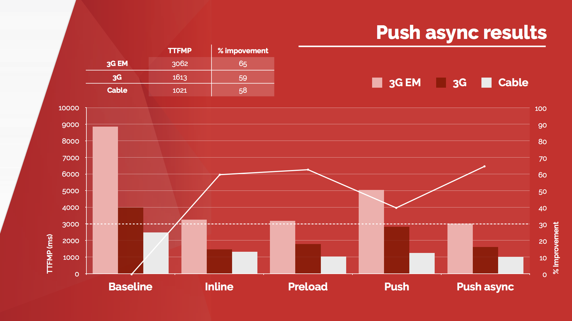
Patrick Hamann showed us a real life case (we need more of those in talks) of the Financial Times website. He worked before on FT.com. The parts were as following:
- Critical CSS
- Preload
- Server push
- Server push async
Critical CSS
We have created a single point of failure (SPOF) with CSS. Inlining the critical CSS is a good solution.
Preload
What you need to ask yourself is “what are my critical resources?”. Luckily, Lighthouse will answer that question for you.
Server push and async
When HTTP2 is supported. Server push needs some configuration, as it can have a negative effect. Slide of this presentation, showing the results after the four steps taken.
Patrick also told us to look at the PRPL pattern, by Google.
Motion in design systems
This talk started with the statement “our deliverables are failing us”. At Mirabeau we’re also struggling from time to time with designing animations. If a designer delivers two static designs, it leaves room for interpretation.
There are several types of deliverables that can help us:
- Storyboards & sketches. This quick technique solves next questions:
- Where is the potential for animation in this new product design?
- How could animations make certain screens easier to understand?
- Motion comps (also called mockups). They can be made with several tools. Solves other questions:
- How should it look like?
- Which elements should move where?
- Does it reflect our brand?
- Interactive prototypes. Can be made in tools like Principle or Codepen. In order to discuss details, you can slow down animation speed in your DevTools.
- Define & document. This saves time and effort later on.
But how do the animations comply with your brand? Usually brand guidelines have a defined tone of voice. This can help you determine how you use easing and speed/timing.
Want more? View the slides of this presentation. And by the way, I’ve bought Val Head’s book Designing Interface Animation to learn more about this subject.
Changing the layout game
This talk started with a recap of techniques used for layout. From tables to flexbox and all the hacks we used to achieve certain layouts. Some of them are good, others are bad. Usually the ‘good’ hacks will eventually return as a standard. For example the fluid image hack became object-fit in the standards.
“Hacking or experimenting, we create our own path” Chris Wright
A while ago, Chris counted the media queries of roughly 50 websites. On average these websites used 264 media queries. It seems outrageous, but it’s a sign there’s a need for other techniques. Media queries are mainly limited to viewports and media types. But we as designers and developers think of design systems, modularity and context.
The constraint for components is available space. I’ve seen quite some articles and talks about element/container queries. As Chris points out, the problem with that concept is infinite loops and the way the CSS parsing works.
There’s another thing: what about component based imagery? You don’t want to serve images that are too big to the user. The picture element only cares about viewport. But there’s a hack for that. SVG has its own document context. By using the tag <foreignObject> we can use <picture> in SVG and serve the right image. Awesome!
A lot of examples of grid were quickly shown. Chris wrote about css grid layout before, it’s worth a read.
Brilliant hacks are creative use of features. Chris encourages us developers to experiment and share our ideas. This way we can move forward with standards.
Microservices - The FAAS and the Furious
Static sites are limited. But the ceiling is far higher than you think. With these sentences Phil kicked off his presentation and told us about doing cool stuff with (boring) static websites. For me this talk was quite interesting, because the very site you read this article on is also a generated static site.
The current stack of publishing and maintaining a site is quite complex. Right now, ‘everything’ happens in the cloud. A website needs to have routing, load balancing, etcetera.
We don’t need that complexity. If we cut out the backend code and code needed by servers. What we’re actually doing here is working with the JAM stack (JavaScript, APIs, and Markup). Phil referred to a good presentation about the mentioned JAM stack.
“Complexity can be a barrier. Simplicity can be an enabler.” Phil Hawksworth
Given a simple use case (displaying a Twitter feed) we looked into our options on how to place this:
- Client side Twitter widget. This means dependency on a 3rd party JavaScript, which can mean unnecessary code and maintenance.
- Client side self made script. This is also depends on JavaScript and external requests (for every page view)
- Backend side content. But how do we fix that with a static website?
With services like IFTTT we can put things into motion. If Phil tweets a webhook goes off. Then, pages get generated and deployed online. This way we won’t need JavaScript on the client side. By using services that’ll execute just one simple script, you’ll make it yourself easier. We don’t need all that backend knowledge. Also, less maintenance and more automation. Sounds awesome, right?
We can do all kinds of things on different services. More tooling is coming, but for now we can look into the following: